Live-data automated reporting
 Cxoice Survey Technologies provides a full range of automated reporting solutions for researchers needing a fast-turnaround, and for researchers needing more than just a stack slides. Cxoice speeds analysis with a full set of tabs available with a couple of clicks, and with a built-in presentation system that makes it easy to show results or create charts or dashboards, with export to Powerpoint if required.
Motivation for improved reporting
The motivation for developing the reporting tools in Cxoice Survey Technologies came from a project where we were asking respondents to choose from and rate hundreds of images using our hotcold (thumbs-up thumbs-down) question types in order to identify themes and preferences.
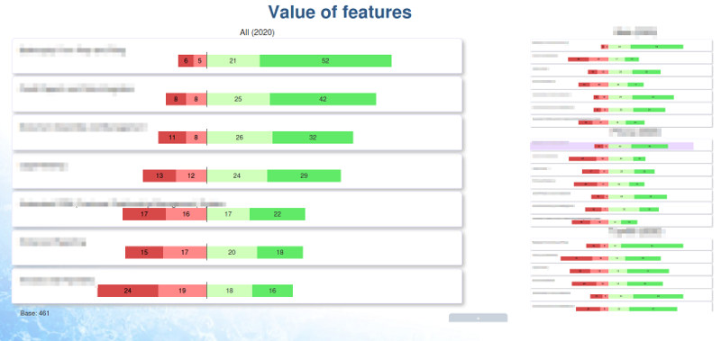
Charting results against images is far from straightforward in most of the off-the-shelf presentation tools, and is painful if you try to build the charts in Powerpoint. As a result we went back to basics to create the presentation tools that we need, that automatically links to the underlying data, where we can do instant drill-downs, use filters to cut and trim chart sets for different audiences and do dynamic sorting and instant exports for on-the-spot analysis.
Survey to presentation - linking the chain together
Cxoice is designed around questions and the questionnaire, and that link is carried all the way through into final outputs. Tables draw on the question definitions direct from the questionnaire itself. Definitions can be overridden, and tables customised for content, but by keeping the link from survey to report, nothing needs to be re-entered, or re-defined. Topline tabs are just a case of setting the banner and pushing a button.
Charts also follow the same principle. Whereas many survey packages offer the chance to create charts from questions and responses, Cxoice takes it to a whole new level. The whole chart set can be created, for the whole survey, at a touch of a button incuding subgroups, significance testing, text based charts, word clouds and tools for drilldown.
The chart set can be trimmed and re-defined, to add takeout text, insert text slides and titles and conclusions, up to the level of adding automated chart summaries and reporting. This can be done with automated filters - eg by country or region, and tailored for specific audiences.
While Cxoice charting does more than Powerpoint ever can, the charts can also be exported to Powerpoint for third party slide decks. Again, at a click of a button.
Beyond the basics - reports on reporting
The chart set can also be incorporated back into questionnaires for training and remote sharing, to help take individuals through the data, while also gathering information such as votes on action points, or tests to check for training success.
Meanwhile, the data can also be exported to third party packages, or incorporated into interactive models for conjoint or pricing type research to identify optimisation points, or matched with external data, or older data to build trend data or financial models.
For help and advice on Cxoice Survey Technologies for projects or to get access to the full suite of insight generation tools contact info@dobney.com
